2026 World Cup Stats Guide: The Numbers Coaches Should Watch
The World Cup 2026 stats coaches should watch: xG, pressing data, line breaks, sprint maps, heatmaps and team compactness, explained in practical terms.
Contents12 sections
- Why World Cup statistics go beyond possession and shots on goal
- Expected Goals: useful, but not the whole attacking story
- Pressing data: when effort becomes organisation
- Line breaks: the passes that change a game
- Final-third entries: getting there isn’t the same as being dangerous
- Sprint maps and high-intensity runs
- Heatmaps: useful, but dangerous if taken too literally
- Team compactness: the statistic coaches might want to watch even more closely
- The real lesson: statistics are starting points, not answers
- From World Cup analysis rooms to everyday clubs
- How zone14 STATS helps
- Conclusion
- Why World Cup statistics go beyond possession and shots on goal
- Expected Goals: useful, but not the whole attacking story
- Pressing data: when effort becomes organisation
- Line breaks: the passes that change a game
- Final-third entries: getting there isn’t the same as being dangerous
- Sprint maps and high-intensity runs
- Heatmaps: useful, but dangerous if taken too literally
- Team compactness: the statistic coaches might want to watch even more closely
- The real lesson: statistics are starting points, not answers
- From World Cup analysis rooms to everyday clubs
- How zone14 STATS helps
- Conclusion
During a World Cup, most people watch the ball.
Coaches watch everything around it.
They see the winger starting his run before the pass is played. The centre-back who drops five metres too early. The midfield line that looks organised until a single pass bypasses it. The striker who presses with a lot of energy but has no support behind him.
That’s exactly why the 2026 World Cup is not just a tournament of goals, stars and great moments. It’s also a tournament of data.
FIFA’s Technical Study Group will analyse all 104 matches, with access to six camera angles and thousands of live data points per match. With FIFA Enhanced Football Intelligence, far more detailed metrics have also entered football, including Expected Goals, line breaks, time to regain possession, pressure on the ball, forced turnovers, team shape and receptions behind the lines.
This is where it gets interesting for coaches.
The best statistics don’t make football more complicated. Used correctly, they make the game easier to understand.
Why World Cup statistics go beyond possession and shots on goal

For a long time, possession was one of the most important numbers after a match.
It still tells part of the story, but only a small part.
One team can have a lot of possession and still create very little danger. Another can have less of the ball but create better chances, win it back in more dangerous areas and attack with more purpose.
That’s why coaches look more closely today. They want to know where possession took place, how the ball was moved through the opponent, how quickly a team reacted after losing it, and whether runs actually influenced the game.
The question is no longer just: who had more of the ball?
But: who made better use of the space?
Expected Goals: useful, but not the whole attacking story
Expected Goals, or xG, is everywhere during the 2026 World Cup.
The metric is popular because it answers a simple question: how good were the chances?
A shot from two metres shouldn’t count the same as a shot from outside the box. xG gives every chance a value that shows how likely it is to produce a goal. Over a longer period, this helps coaches see whether a team really creates dangerous chances or just shoots from unpromising positions.
But xG is also easily over-interpreted.
A team can build a high xG from a penalty or one big chance without posing much threat from open play. A striker can miss a high-quality chance because the pass arrives slightly behind him, the finish is rushed, or the goalkeeper narrows the angle superbly.
So xG is useful, but not the final word.
It tells coaches something about the quality of the chances. It doesn’t explain the whole attack.
Pressing data: when effort becomes organisation

Pressing is one of the areas where statistics show more than you can see live with the naked eye.
Everyone sees a striker sprinting at a centre-back. It’s harder to see whether the rest of the team is working with him.
Does the winger close down the full-back? Does the midfield push up? Does the back line step forward? Or does one player press while the rest of the team stays too deep?
At World Cup level, these are exactly the details that decide matches. Pressing isn’t just about running a lot. It’s about timing, distances and the connection between players.
That’s why metrics such as time to regain possession, pressure on the ball and forced turnovers are valuable. They show whether a team really disrupts the opponent or only looks aggressive.
A high press that wins the ball near goal is easy to praise. But a clever mid-block that forces the opponent wide for 20 minutes can be just as important.
Data helps coaches tell visible effort apart from real control.
Line breaks: the passes that change a game
Some of the most important actions in football never show up as a goal or an assist.
A centre-back plays through the first line of the press. A midfielder receives the ball behind the opposing midfield. A winger takes the ball in behind the full-back. Suddenly the whole structure of the game changes.
That is the value of line breaks and receptions behind the lines.
These statistics show how often a team gets the ball behind an opposing line. Not just across the pitch. Not just safely from one player to the next. But through the opponent.
At a World Cup this is especially interesting, because teams face very different playing styles. Some opponents sit deep and compact. Some press high. Some protect the centre and leave space out wide. The teams that succeed are often the ones that find the right way through, around or behind that structure.
A team can play 500 passes and still avoid the important spaces.
One clean reception between the lines can do more damage than twenty safe passes between centre-backs.
Final-third entries: getting there isn’t the same as being dangerous
Final-third entries sound simple: how often does a team get the ball into the final third?
It only gets interesting when you look at the type of entry.
Was it a controlled pass to a player who could turn? A hopeful cross? A dribble after winning the ball? A long ball into space? A full-back arriving late after a switch of play?
Two teams can have similar numbers of final-third entries and still look completely different. One gets into the final third under control and creates cut-backs. The other keeps reaching wide areas but has nobody in the box.
That’s exactly why this statistic helps coaches. It starts the better discussion.
Do we get into dangerous areas with enough support? Are our wingers isolated? Do we reach the final third but fail to create real chances?
These are questions every club can ask, not just national teams.
Sprint maps and high-intensity runs
Running data always gets a lot of attention at major tournaments.
But total distance is often a rough number.
One player can run twelve kilometres without really changing the game. Another runs less overall but has five decisive high-intensity actions: a recovery sprint, a run in behind, a counter-press, a covering run or a sprint into the box.
That’s why sprint maps and high-intensity running data are more interesting than distance alone. They show where the demanding actions took place.
For a winger, the sprint map can show whether he attacked the space behind the full-back or was almost only played into feet. For a full-back, it can show whether he supported attacks, sprinted back after transitions or spent the whole game chasing.
GPS systems have helped clubs understand physical performance for years. They remain valuable, especially for managing load in training and matches.
But for coaches, it’s not only how far a player ran that matters.
What matters is what those runs meant in the game.
Heatmaps: useful, but dangerous if taken too literally
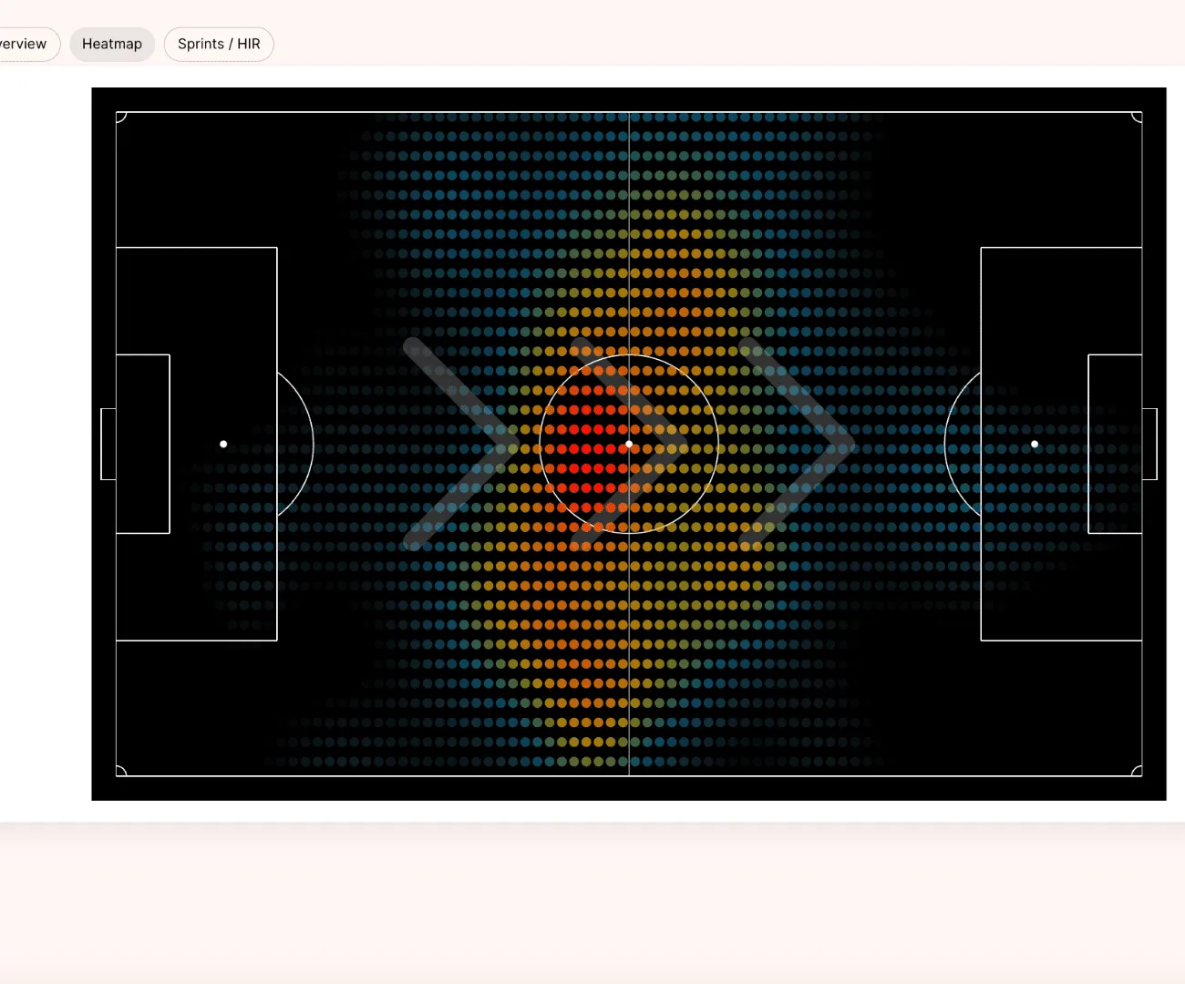
Heatmaps are among the statistics that are quickest to understand.
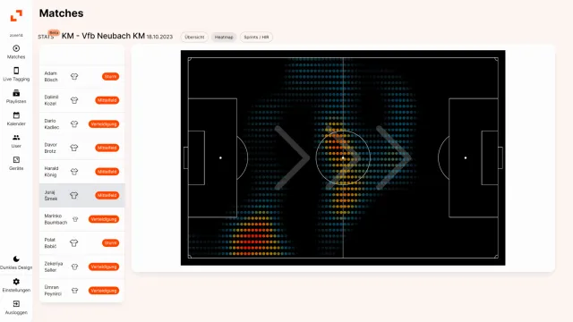
They show the areas where a player was active. That makes them useful for analysing roles. Did the left-back push up? Did the winger stay wide? Did the striker drop into midfield? Did the holding midfielder cover both sides of the pitch?
At the World Cup, heatmaps help to read player roles, especially for flexible full-backs, inverted wingers and midfielders who rotate into different spaces.
But heatmaps have to be read carefully.
A full-back who stays high for most of the match can be a sign of attacking dominance. But it can also mean his team is constantly chasing the game. A striker who drops deep can help the team link attacks. Or he leaves nobody in the box.
The heatmap is not the conclusion. It’s a clue.
Team compactness: the statistic coaches might want to watch even more closely
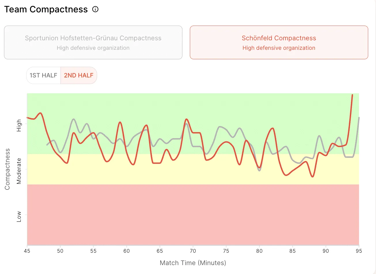
If there is one team statistic coaches should pay particular attention to at the World Cup, it’s compactness.
Compactness describes the distances between players and between the units of a team. How close is the midfield to the defence? Are the strikers connected to the rest of the team? Does the team protect the central spaces or get pulled apart?
Good compactness helps with pressing. It helps with counter-pressing. It makes second balls easier to win. And it reduces the spaces the opponent can play through.
At World Cup level, that can be the difference between a controlled match and a chaotic one.
When a team loses its compactness, gaps open between the lines. Suddenly one pass takes out four players. A midfielder can turn. A centre-back has to step out. The back line drops. The whole team ends up defending towards its own goal.
These are the details coaches talk about long after the highlights.
It’s also one of the clearest examples of why team statistics are becoming more and more useful outside professional football. Compactness isn’t an abstract number. It’s something players see immediately when the right moment is shown on video.
The real lesson: statistics are starting points, not answers
This point shouldn’t get lost.
Statistics help coaches find patterns. They don’t coach the team on their own.
A low number of sprints can look worrying. But maybe the player had a different role. Maybe the team never created the spaces he could have run into. Maybe the opponent sat so deep that there was no space behind the last line.
Lots of final-third entries can look positive. But maybe most of them ended in poor crosses from bad angles.
A strong pressing number can show intensity. But maybe the team kept leaving space behind its press and was just lucky the opponent didn’t use it.
That’s why the best analysis is never just numbers or just video. It’s the combination.
Data points the coach to a pattern. Video shows the specific moments. The coaching staff decide what really matters, what can be improved and what belongs on the training pitch.
From World Cup analysis rooms to everyday clubs
National teams have analysts, data providers, tracking systems, multiple camera angles and experienced staff. During the World Cup, they use this support to prepare for opponents, assess performances and understand the small details that decide matches.
Most clubs don’t have this setup.
But the gap is getting smaller.
Amateur, academy and semi-professional clubs already use video much more deliberately. They record matches, cut key scenes and give players visual feedback. The next step is to bring useful statistics into that process.
For some clubs, GPS systems are the right way. They are especially helpful for physical preparation and load management.
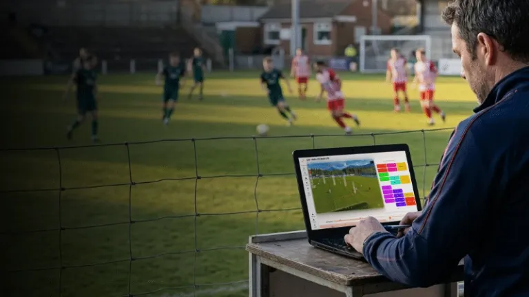
For other clubs, video-based statistics are a more practical start. The match is recorded anyway. Players don’t have to wear anything. The data comes from the footage and links straight back to the match.
That makes statistics less intimidating.
They’re no longer something that only belongs to analysts.
They become part of the normal coaching conversation.
How zone14 STATS helps
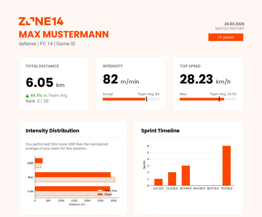
Request a sample report
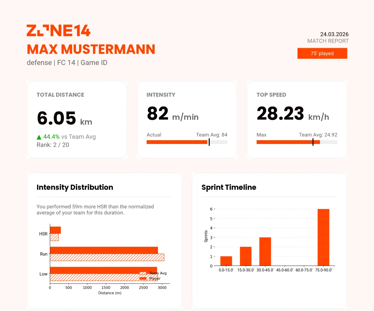
Top speed, sprints and distance covered as a PDF for every player, straight from the match video: with football tracking without GPS vests from zone14 STATS.
On its way!
Your sample player report will be sent to your email shortly.
Test mode: no webhook is configured for this form, nothing was forwarded.
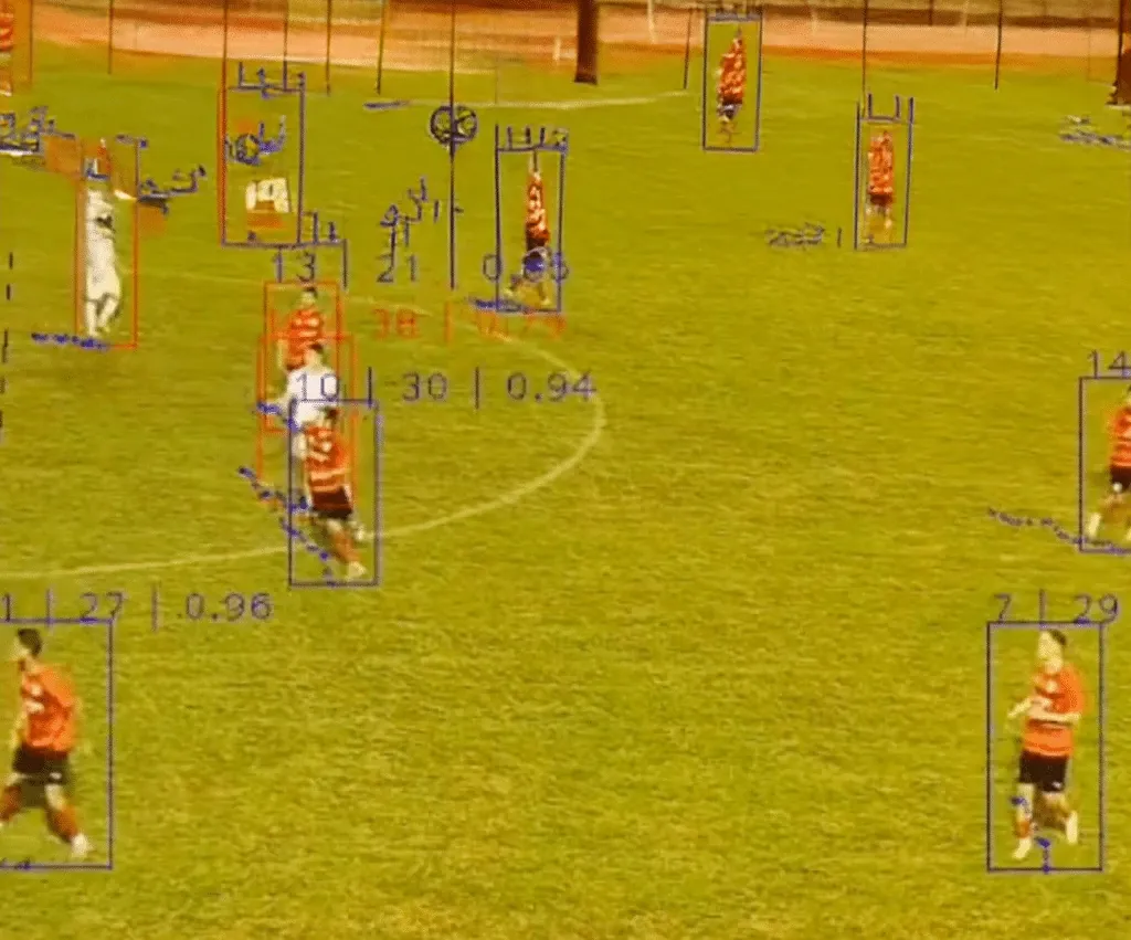
This is exactly where zone14 STATS comes in.
With zone14 STATS, clubs turn match videos into performance and tactical data. That includes distances, sprints, sprint maps, heatmaps, team compactness, team dominance and individual player reports.
No GPS vests. No extra hardware at the pitch. No manual tagging from scratch.
For coaches, the benefit is practical.
Before a feedback session, a player report helps find the right scenes. Sprint maps show whether a winger attacked the right spaces. Heatmaps support conversations about positioning and role discipline. And team compactness shows when the distances between players helped – and when they opened the game up too much.
It’s not about turning every club into a data department.
It’s about making statistics useful for the people who actually work with the team.
Conclusion
The 2026 World Cup shows football at the highest level. It also shows how much the game is understood through data today.
But the lesson for clubs isn’t that they need every statistic available.
They need the right ones. The ones that help coaches ask better questions, find clearer examples and give players feedback they understand.
That could be a sprint map. A heatmap. A compactness metric. A player report. Or a simple number that sparks a much better discussion.
Used correctly, football statistics don’t take the game away from coaches.
They bring the important moments into focus.