Dominance & Match Momentum: What the 2026 World Cup Showed and How Coaches Can Use It
Match momentum graphs were everywhere at the 2026 World Cup. Learn the different ways to measure momentum, from danger to territorial dominance, and how zone14 STATS shows team dominance from your own match video.
Every coach knows the feeling. For twenty minutes, nothing works. The opponent wins every second ball, your team can’t get out of its own half, and you know the next goal is coming. Then one press, one won duel, and the game turns.
We call it momentum. For a long time, it was only a feeling on the bench.
At the 2026 World Cup, it became a graph. Millions of viewers saw a curve swing up and down in the corner of their TV screen, showing which team was on top at any moment.
In this article we explain what match momentum is, the different ways to measure it, what the World Cup final between Spain and Argentina showed, and how amateur and semi-professional clubs can use the same idea with zone14 STATS, from their own match video.
What is match momentum?
Match momentum shows how the balance of a game shifts over time. Instead of a single number for the whole match, such as 60% possession, you get a curve: minute by minute, which team was on top.
At the 2026 World Cup, momentum graphs were everywhere: in Fox’s broadcasts, on the BBC and in many other TV and app formats around the world. The chart has a centre line. When the curve goes up, one team is on top. When it goes down, the other team is.
The idea is simple: football is not one story. A 1–0 can be a match one team controlled from start to finish, or a match that swung four times.
Different views on momentum
There is no single definition of “being on top”. Different models answer the question differently, and each one shows a different side of the same game.
Momentum as danger
The best-known view looks at threat. Every action on the ball is rated by how much it increases the chance of scoring soon after: a pass into the box counts for much more than a safe pass at the halfway line. The most dangerous moments of the last few minutes are combined into one value per minute, and the curve shows which team was creating the bigger threat.
This is the version most viewers saw on TV at the World Cup. It needs detailed event data for every pass, carry and shot, which professional data providers collect for every match.
Momentum as territorial dominance
The second view looks at space: where is the game being played? Which team pushes the other back, and which team is pinned in its own half?
Territorial dominance doesn’t ask how dangerous a single pass was. It asks which team controls the pitch. A team that keeps the opponent in its own half for ten minutes has momentum, even if it hasn’t created a big chance yet. And a team that is constantly pressed back into its own half is under pressure, even if the score is still level.
Two views, one game
In practice, both views usually move together. Teams that push the opponent back tend to create more chances. When they don’t, that is exactly the interesting part: a team can dominate territory without creating danger, or create danger from very little territory through counter-attacks.
For coaches, territorial dominance is often the more useful view, because it describes the team’s behaviour as a unit: pressing height, pushing up, and the ability to get out of pressure.
What the 2026 World Cup final showed
The final on 19 July 2026 at MetLife Stadium is a good example of why a momentum curve tells you more than the score.
Spain beat Argentina 1–0 after extra time. Ferran Torres scored in the 106th minute. On the scoreboard, that looks like a tight game that could have gone either way.
The flow of the match told a different story. Spain controlled the ball and pressed relentlessly, and Argentina spent long stretches pinned in their own half. Spain had around 20 shots. Argentina did not register a single shot in regulation time, a first in a World Cup final. Enzo Fernández was sent off with a second yellow card in stoppage time, and Argentina played all of extra time with ten men.
Whichever view you take, the curve of that match sits on Spain’s side for long stretches. The goal came late, but the dominance was there from the start.
The coaching lesson: the result and the performance are two different things. A team can dominate and draw. A team can be dominated and win. If you only look at the scoreline, you draw the wrong conclusions for the training week.
The limits of momentum graphs
Not everyone was convinced. During the tournament, critics argued that the TV graphic mostly shows what viewers have already seen with their own eyes, and that its scale is hard to read.
That falls short. Whether in the stadium or in front of the TV, you mainly follow the ball. How long a team was really pinned back, or when the game slowly started to turn, is something you feel in the moment but can hardly pin down. The curve makes exactly that visible and comparable.
For a coach, this matters even more. You don’t watch your match once, live, with full attention on the whole pitch. You watch it from the sideline, emotionally involved, focused on a few players. Afterwards, memory is selective. A curve over 90 minutes is an objective reference: it shows exactly when the game tipped, so you know which minutes to watch again.
Momentum graphs are not an answer. They are a table of contents for the video.
Territorial dominance with zone14
Danger-based momentum needs detailed event data that professional leagues collect for every match. Amateur clubs don’t have it.
What amateur clubs do have is match video. And from video, you can measure territorial dominance.
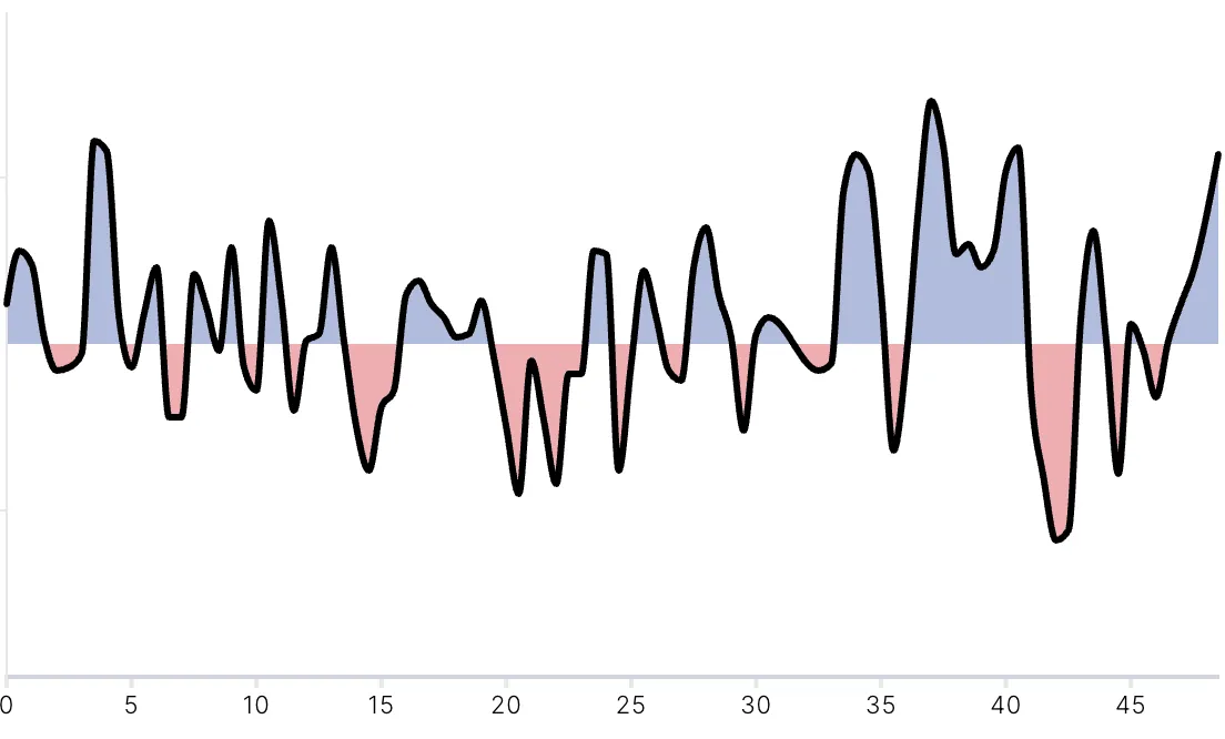
Team dominance in zone14 STATS shows in which areas of the pitch your team was more present than the opponent, and how that shifted over the course of the match. The chart at the top of this article reads like a momentum curve. Above the centre line, one team pushes the other back. Below it, that team is pressed into its own half.
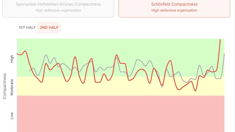
Dominance shows where the game is played. Team compactness shows how your team is organised while it happens. Together, they explain whether your team pushed the opponent back as a compact unit, or got stretched and pressed into its own half.
How coaches can use dominance with zone14
A dominance curve becomes valuable when you link it to concrete questions. Here are typical patterns and what they can mean.
Phases after goals
Did your team drop back after scoring? Did it take five minutes to recover after conceding? Look at the dominance curve in the ten minutes after each goal. Many teams lose control right after taking the lead, without anyone noticing it on the day.
The start of each half
The first ten minutes after kick-off and after the break show how well your team implements the plan from the dressing room. A curve that starts on the opponent’s side every time is a topic for the warm-up and the team talk.
The last 20 minutes
When dominance drops late in the game, it can be fatigue, substitutions or a tactical change by the opponent. Combine the dominance curve with distances and sprints from the same match to see whether physical output dropped at the same time.
Pressing phases
If your team presses high, the dominance curve should be on your side during those phases. If it isn’t, the press probably isn’t winning the ball, or the team behind the first line isn’t pushing up. Check team compactness for those minutes too.
From the curve to the video
The most important step: use the curve to find the scenes. Find the minute where the curve flips, jump to it in the video, and watch the two or three minutes before. That’s usually where the cause is: a lost duel, a positional change, a substitution, a switch in the opponent’s build-up.
Instead of “we lost control in the second half”, a coach can say: “From minute 62, the opponent pushed us back for eight minutes. Let’s look at what changed after their substitution.”
That is concrete, understandable and something players can work on.
Why this matters for amateur football
At professional level, momentum and dominance data come from dedicated data providers and analysis departments. In amateur football, coaches often have one match video and very little time.
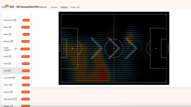
That’s why the data has to come from where the video already is. With zone14 STATS, the match video becomes performance and tactical data: distances, sprints, sprint maps, heatmaps, team compactness, team dominance and individual player reports. Players don’t wear GPS vests, and nobody has to tag the match manually.
The World Cup showed how a single curve can tell the story of a match. Your own matches have stories like that too, and you can see them in your own data.
zone14 STATSStatistics for football without a GPS trackerDiscover now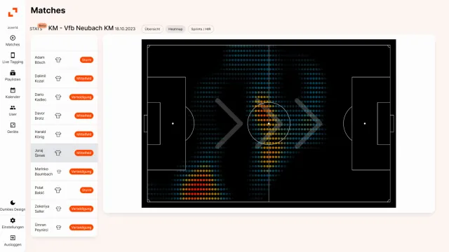
Conclusion
Match momentum was one of the most visible new statistics at the 2026 World Cup. It shows how the balance of a game shifts minute by minute, and the final between Spain and Argentina showed why that matters: a narrow 1–0 can hide a complete territorial dominance.
For coaches, the curve itself is not the goal. Its value lies in showing when the game turned, so you can find the right scenes in the video and bring them into the training week.
With team dominance in zone14 STATS, clubs get that view from their own match video, without GPS vests or manual tagging.